A Configurator for
Elli Charging
B2B-Plattform
Für
Elli CharGing

From B2C to B2B: Elli's scalable platform is now the backbone for the digital shops of Audi, Škoda, CUPRA, and Volkswagen — cross-brand, from one central system.

Year: 2022 - 2023

Role: UX & UI Design

Agency: Elbkapitaene GmbH

Client:

elli.eco

Goal

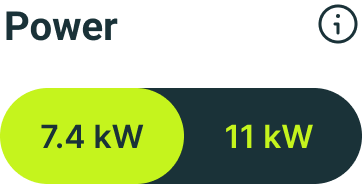
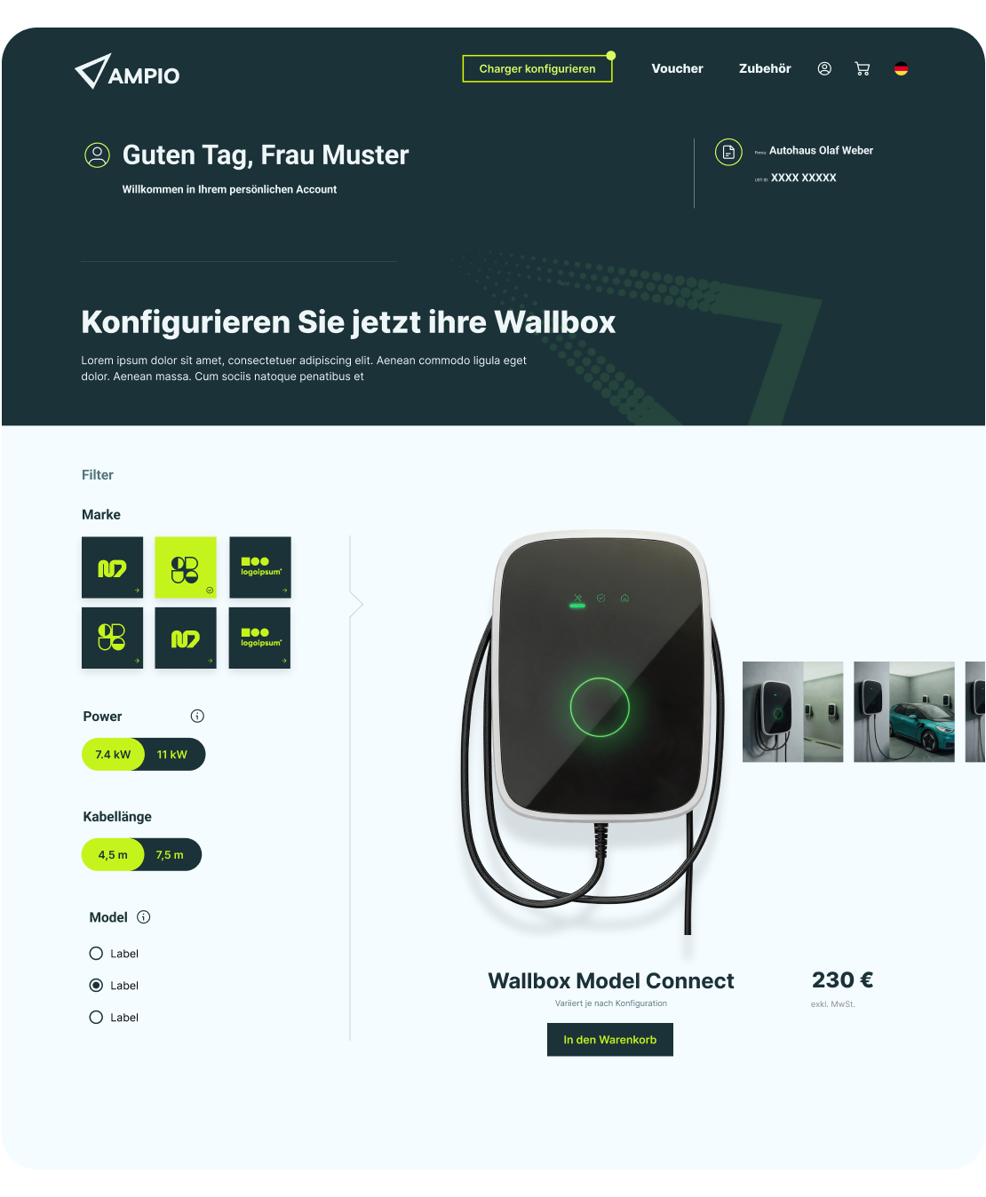
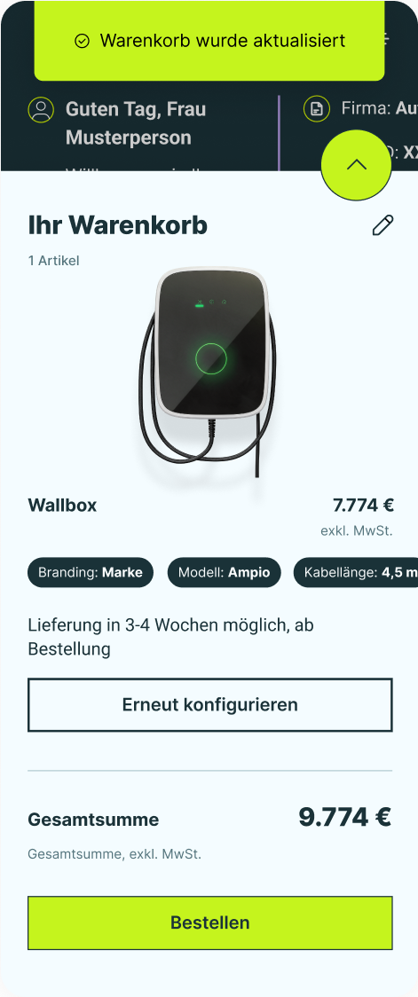
As the Volkswagen Group's integrated energy and charging solution, Elli is driving the shift to e-mobility — through its own brand and a central, group-wide platform. To speed up the B2B rollout of this charging infrastructure, the idea for a smart B2B configurator took shape: a tool that lets dealership sales teams put complex wallbox setups together without errors, even though they're not tech experts and work under real sales-floor pressure.
As Senior UX/UI Designer, I shaped this digital product strategically and visually — owning it end to end, from early user research all the way to the final interface design.

Strategy

It started with a reframe: instead of a static product page, why not let dealers configure their way to exactly the wallbox they need?

That shift was the foundation everything else was built on. The hard part was the complexity underneath — brand compatibility, cable lengths, power levels — which had to become an intuitive information architecture that never overwhelmed the user.

My guiding principle was radical simplicity: no clutter, no unnecessary cross-teasers, nothing that pulls focus from the task. I built this as a modular UI design and an interactive high-fidelity clickdummy, then validated it early — user testing the prototype with selected salespeople in real dealerships, watching where they hesitated.

Outcome

The testing gave me something better than assumptions: real data. I saw exactly where users slowed down and reworked the UX and UI around those moments — removing usability barriers before a single line of code was written, which spared costly rework later.

The design was handed over to the development team and built exactly as designed, going live as the B2B ordering portal dealerships actually used on the floor.

I owned that handover end to end, guiding the developers through the details so nothing got lost between design and code — the same principle I bring to every project: the work isn't done when the design looks right, but when it survives contact with reality.

The Future of Food,
Made Digital
Erlebe die
Zukunft der
Ernährung
Digital!

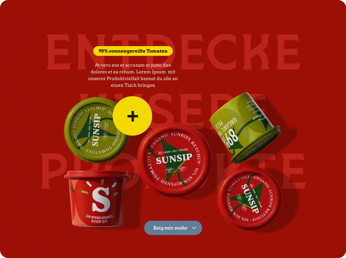
When everyone's at the table, there's no either-or — that's the idea behind the new website.

Year: 2023 - 2024

Role: UX & UI Design

Agency: Elbkapitaene GmbH

Client:

Rügenwalder Mühle

Goal

As one of the industry's early movers on plant-based food, Rügenwalder Mühle sees itself as a bridge-builder at the dinner table — community over debate, bringing people together instead of splitting them into camps.

The new website had to carry exactly that: one platform that feels equally welcoming whether you eat meat, veggie, or vegan.

Beyond being accessible to every audience, it had to make exploring the product range something you genuinely enjoy — an inspiring food experience, not just a catalogue.

Strategy

The client handed us a brand styleguide — but a rudimentary one, just a handful of basic elements. My main task was to translate it into digital and, above all, expand it into a full UI: the components, states, interaction patterns, and responsive behavior the original guide never covered.

I turned a static set of brand basics into a working design language the whole site could be built on. My personal focus throughout was on how it feels to move through the site — navigating the product world should spark curiosity and a sense of discovery, not just list products.

The project also took real patience: many stakeholders were involved, plus other agencies handling social, brand, and more. Holding the design system coherent across all those hands took as much coordination as craft — but the collaboration worked.

Outcome

To make the design tangible for everyone signing off on it, I developed an animation concept and built it as an interactive prototype in Protopie — so decision-makers could see my vision in motion instead of picturing it from static screens. With so many stakeholders and agencies at the table, that step was decisive: rather than debating flat mockups, everyone could experience how the interactions should feel, which kept the playful, discovery-driven character intact through every round of feedback.

The website went live exactly as designed and is still in use today. The expanded design carried the brand's spirit onto the site — balancing fun, inspiration, and clear product information — and turned a rudimentary styleguide into a living digital experience.

Alpina:"Feine Farben"
– Campaign Website
Alpina:
"Feine Farben"
Digital-
kampagne

A premium wall-paint collection, put center stage — with product deep-dives and color inspiration.

Year: 2019

Role: UX & UI Design

Agency: Davies Meyer GmbH

Client:

Alpina Feine Farben

Goal

Alpina's "Feine Farben" is a premium collection of refined, matte wall paints — products with real character and exceptional quality.

The landing page had to make this collection explorable in detail: getting to know each shade, understanding its exceptional color quality, and finding an emotional way in through a prominently staged brand film.

Plus room for inspiration — all at a level worthy of the product: nothing loud, nothing cluttered, the colors always in focus.

Strategy

There was no styleguide to start from — all I had were the colors, the video, and the photography. From that, I built the full UX and UI: a single page as scrollytelling that leads through the color world.

For the look, I picked up the muted colors themselves and worked with lots of whitespace — giving the whole thing a sense of prestige.

Every color tells a story, and I gave those stories room through generous open space, so nothing feels cluttered. Carefully placed animations give the content extra expression.

Outcome

The result is an elegant onepager that puts the collection center stage: the muted palette and plenty of room set a calm, high-end tone from the start.

An integrated social wall brings in inspiration, the brand film carries the emotional side, and the exceptional color quality becomes tangible up close. And when a color clicks, interest turns into a next step: you can order the color catalog directly or find a nearby retailer through the dealer locator.

The design went live exactly as designed and is still online today.

Alpina:"Holzschutz"
Complexity, Guided
Alpina:
"Holzschutz"
Produktseite

Complex wood-care products, made simple through a guided, step-by-step flow. Whether you're a seasoned pro or picking up a brush for the first time, the right product is only a few questions away.

Year: 2019 - 2020

Role: UX & UI Design

Agency: Davies Meyer GmbH

Client:

Alpina Holzschutz

Goal

Alpina's "Holzschutz" range is broad and technically complex — the right product depends on the wood, its condition, and the project at hand. The goal was to make that complexity approachable: to guide people to exactly the right product for their situation, whether they're seasoned pros who need no hand-holding or first-timers who want real guidance.

Instead of a static product list, users should feel advised — led step by step to a confident decision, the way a knowledgeable salesperson would walk them through it in a store.

Strategy

At the start, the focus wasn't on visual design but on how to guide the different personas. For each, I built separate user flows, because the audience splits into three: pros, people with some experience, and complete beginners.

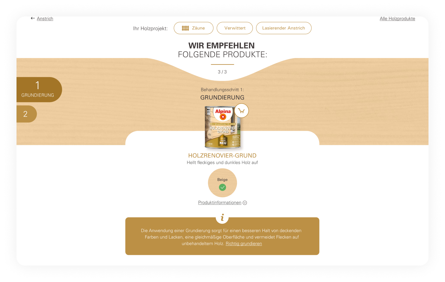
The core idea was to turn product selection into a guided click-path: users say what they're working on — which wood project, what condition the wood is in — and are led step by step to exactly the right product. I created the full UX and UI and built it as an interactive clickdummy, so the whole decision logic could be tested before development.

Outcome

The result was a guided product finder that breaks a complex, technical range down into a few clear questions: answered with a click, and you land on the right product with confidence.The focus was firmly on the click-path: every question is backed by fitting imagery, and optional tips can be shown at any step for anyone who wants them.

The interface stays calm and focused throughout, letting the wood and the products carry the visual weight.It's UX doing the quiet, hard work: making something genuinely complex feel effortless to the person using it.

HSV Pitch —
Closer to the Fans
HSV
Pitch layout
Lorem mudda

A pitch-winning concept for a full digital relaunch — designed to bring fans closer to the club than ever.

Year: 2023

Role: UX & UI Design

Agency: Elbkapitaene GmbH

Client:

HSV

Goal

HSV wanted a complete website relaunch: more interactivity, a genuinely better user experience, and a digital home that matched the size of the club. The bigger ambition behind it was closeness — bringing the club nearer to its fans.

Not just scores and news, but more interviews, more podcasts, more room for the players as people, and more space for fans to interact with each other. The brief was clear: turn a standard club website into a living fan platform.

Strategy

We started with the people, not the pixels. Together with a second UX designer, I helped define three core personas — the heavy user who checks the site every day, the casual fan, and the visitor who just wants to buy a ticket — and mapped a dedicated user flow for each, so every type of fan finds their path fast. The club's existing styleguide was strong but built for print — thorough, yet not thought through for digital.

My job was the UI: I translated that print-first identity into a full digital design system, built from the ground up for screen, interaction, and scale. Throughout, our guiding idea was closeness — giving players a stage, fans a voice, and the club new ways to be present in everyday fan life.

Outcome

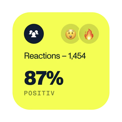
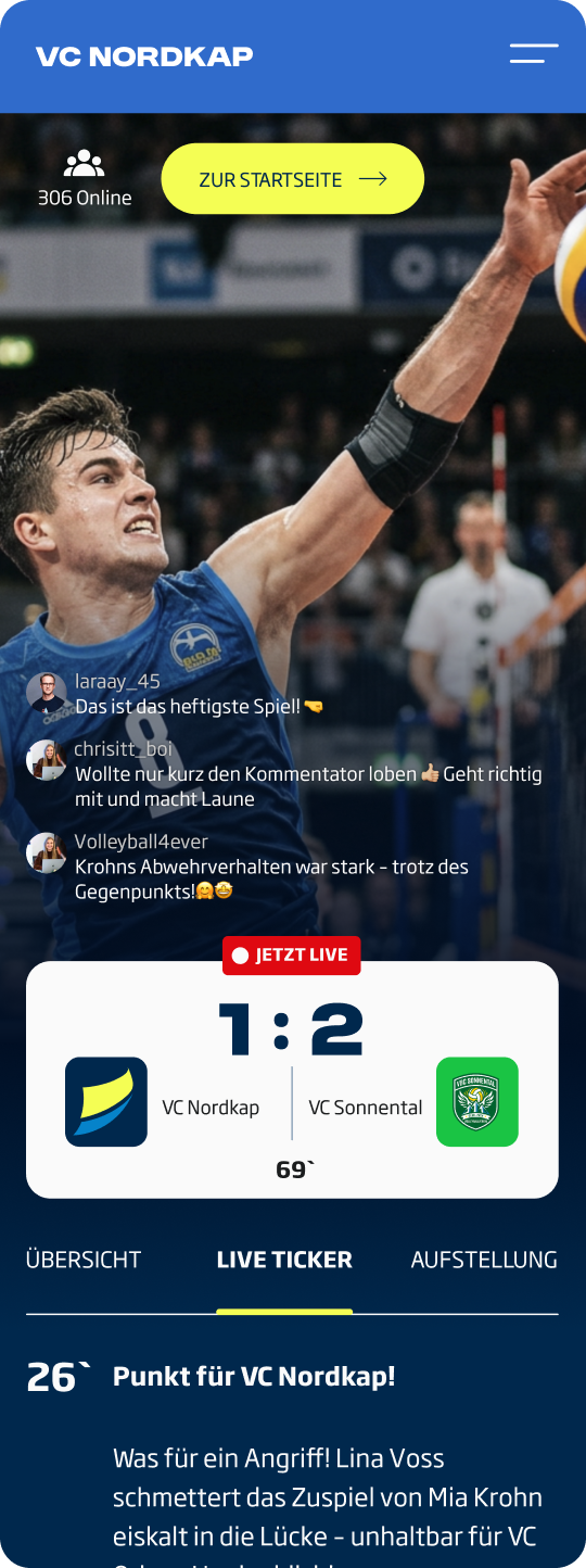
The concept went further than a relaunch: we proposed live matchday broadcasts right on the site, with a real-time chat, reactions, and the kind of energy fans know from live social streams — turning match nights into a shared digital experience. The vision was to make HSV.de more than a news site:

a place where fans feel close to the club and to each other — closer, louder, and more interactive than before.

Hapag-Lloyd Cruises
— Premium, Made Digital
Hapag lloyd
cruises.
Mit allen
Sinnen Digital

Translating a five-star cruise brand into a digital experience — inspiring, accessible, and with a booking journey that actually flows.

Year: 2023 - 2026

Role: UX & UI Design

Agency: elbkapitäne GmbH

Client:

Hapag Lloyd Cruises

Goal

Hapag-Lloyd Cruises had gone through a brand relaunch, and the website needed to catch up: the new look and feel translated to the web, and a strongly print-based styleguide brought into a living digital system. But this went beyond a fresh coat of paint — several core modules needed rethinking, from the booking flow to the cruise detail pages.

The goal was to carry the brand's premium promise into every screen: inspiring and emotional, yet clearly structured, and to make the path from first spark of interest to booking feel effortless.

Strategy

I started by looking outward: I researched benchmarks across the premium travel segment, studying how other high-end brands solve inspiration, navigation, and booking — then evaluated what would genuinely fit Hapag-Lloyd Cruises rather than copying a trend.

From there, I translated the print-first styleguide into a coherent digital UI, and developed concepts for the modules we challenged most: the booking flow and the cruise detail pages as the heart of the customer journey.

None of it was guesswork. Together with the client, we evaluated the site's tracking data and wrote acceptance criteria for each ticket — then optimized the UI against them, round after round. It's a way of working I value: design decisions grounded in real behavior and shared, measurable goals, not opinion.

Outcome

The brand relaunch is live: the premium world of Hapag-Lloyd Cruises now carries consistently across the site, its print-first identity translated into a digital experience that finally matches the brand behind it. The reworked booking flow and cruise detail page concepts turned dense travel information into a clearer, more guided path — one that respects both the emotion of the journey and the visitor's need to decide with confidence.

Because every change was measured against real tracking data and agreed acceptance criteria, the improvements weren't cosmetic — they were built to move the metrics that matter. Grounding a premium feel in evidence is exactly where art direction and UX meet.

TÜV Nord
- Design System
TÜV Nord
designSystem

A print-based styleguide turned into a living digital design system — documented so the whole editorial team can build with it.

Year: 2024

Role: UX & UI Design

Agency: Elbkapitaene GmbH

Client:

TÜV Nord

Goal

TÜV Nord had a styleguide developed by a brand agency — strong, but conceived for print, not for the web. My task was to translate it into a working digital design system: a global styleguide with every element defined, backed by clear, practical documentation the whole team could actually navigate.

The bigger goal wasn't a one-off website — it was a foundation. TÜV Nord's content is maintained by editors, so the system had to empower people who aren't designers to build consistent, on-brand pages on their own, long after the project itself was done.

Strategy

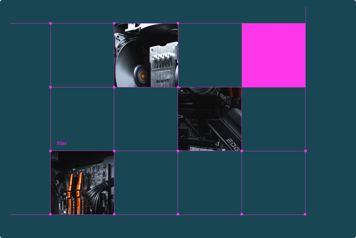
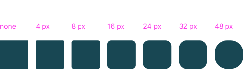
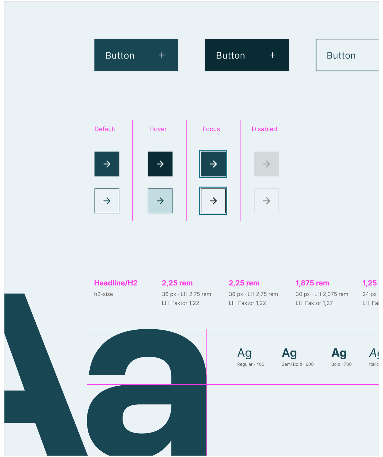
I worked the Atomic Design way — from the smallest element up. First I set the design tokens: grids, colors, icons, font scales. On top of those came the components, then the modules, and finally ready-made templates the editorial team assembles from the modules themselves — including which modules work well together, so nothing breaks the design.

That's how the brand holds together across the whole site rather than being reinvented page by page. But components alone aren't enough if no one knows how to use them — so I put real weight on documentation: clear, navigable, written for editors, not just designers. The guiding question wasn't "how do I design this page?" but "how do I design a system that lets non-designers make good decisions?"

Outcome

The result is a complete digital design system that gives TÜV Nord a consistent visual language across its site — and, just as importantly, the documentation and templates to keep it that way. The website is live and maintained by TÜV Nord's own editors, who build and update pages using the system I created — which is exactly the point: a design system succeeds when the people using it every day never have to guess.

My role was the foundation, not the upkeep, and that's the real measure of it — the system holds up without me in the room. Good design systems don't just make things look right once; they make it hard to get them wrong later.

DT Swiss
— Wheel Finder
DT Swiss
Website-
relaunch

A guided configurator that helps riders find exactly the right component — precision UX for a deeply
technical brand.

Year: 2022 - 2026

Role: UX & UI Design

Agency: Elbkapitaene GmbH

Client:

DT Swiss

Goal

DT Swiss makes highly technical cycling components — wheels, forks, rims, spokes, hubs — and their range runs deep.

Over time, I optimized and built a number of modules for them on the UX and UI side, most notably the Wheel Finder.

The challenge wasn't just structuring dense technical information — it was doing it for a precision-obsessed brand, where getting the details right matters as much on the website as it does in the product itself.

Strategy

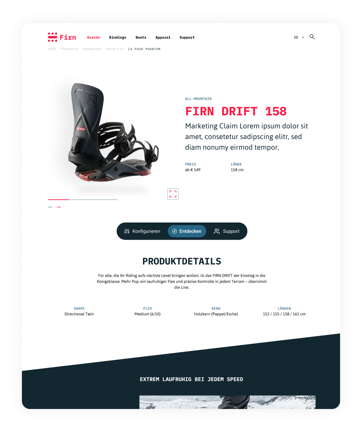
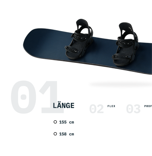
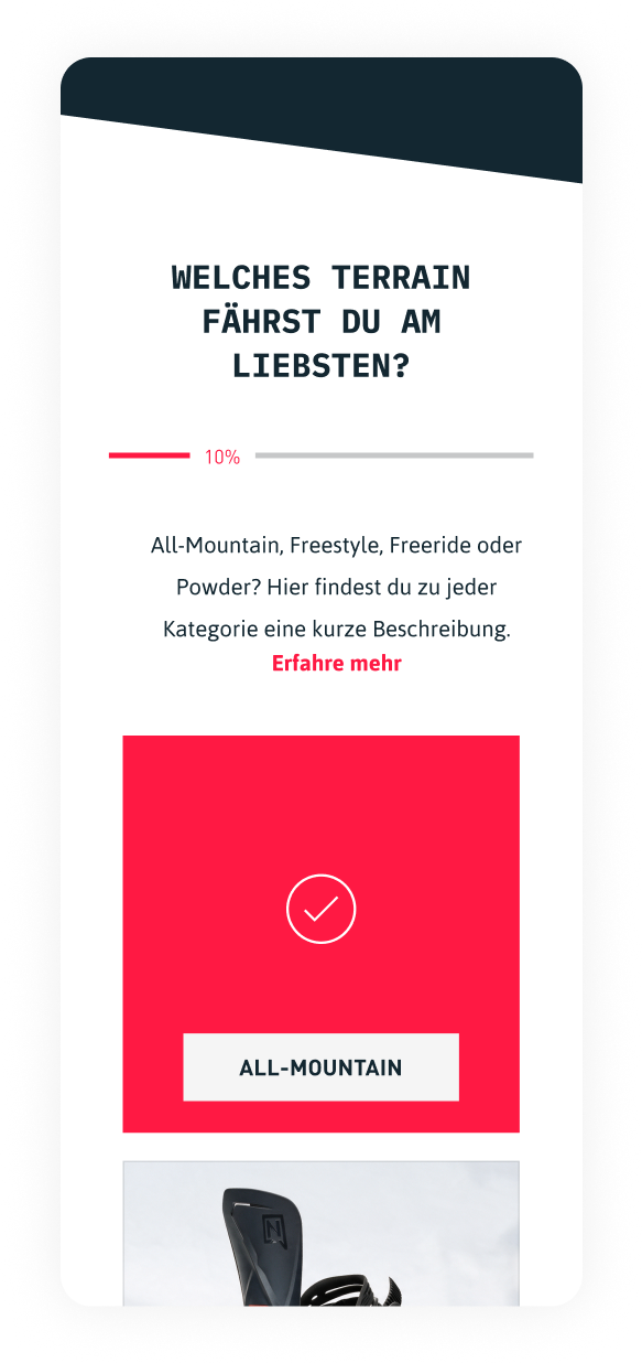
With a technical client like DT Swiss, you can't design from the outside — you have to read deep into the subject and define the user needs with real clarity before touching the interface. That groundwork shaped the modules I worked on, above all the Wheel Finder: a step-by-step flow that guides riders through configuration — filtering by use case, identifying the right material, narrowing down to the component that actually fits their bike. Throughout, I worked within a deliberately minimalist visual system built on just three colors — black, red, and white. With no room to hide behind decoration, every UX decision had to earn its place, and clarity had to come from structure and hierarchy rather than embellishment. I worked in close, agile collaboration with the client, refining the details round after round.

Outcome

The Wheel Finder makes an overwhelming technical range navigable without expertise. Working within the strict three-color system proved a point I keep coming back to: restraint sharpens rather than limits.

With black, red, and white as the only tools, the minimalism keeps the focus entirely on the product and the decision at hand — nothing competing for attention.

It wasn't my biggest engagement, but it was one of the most precise: technical, detail-driven, and a reminder that with the right constraints, less really does do more.